
Language: Deutsch · English
 Component properties
All component properties at a glance – position, display, behaviour and subform/container options.
REFERENZ APPLICATION DEVELOPER UPDATED: JUL 2026 APPLIES TO NUCLOS 4.2026.X
On this page
Why properties?
All components are essentially the same – only the properties make them what is needed. They are set via the context menu → Properties and vary by component type and user mode.
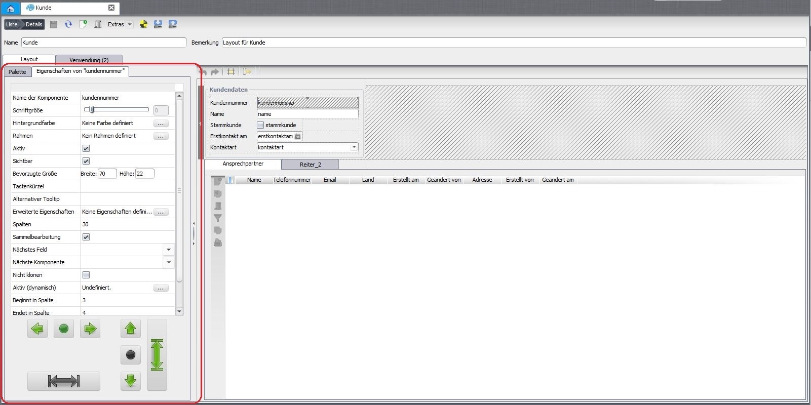
Properties dialog of a component.
Layout constraints
| Property | Meaning |
|---|---|
| Starts/ends in column/row | grid area the component occupies (may span several cells). |
| Horizontal/vertical alignment | alignment within the cell(s). |
| Preferred size | fixed size – only effective if „fill“ is not set. |
Display & behaviour
| Property | Meaning |
|---|---|
| Active | allows/prevents input (e.g. read-only display). |
| Visible | shows/hides the component (e.g. parameter fields). |
| Opaque | own background colour opaque or transparent. |
| Background colour / font size | colour and relative font size. |
| Border | border per component/container (border editor) to separate/group. |
| Alternative tooltip | overrides the default tooltip; line break via <html>…<br>…</html>. |
| Keyboard shortcut | jump to the component via the ALT key. |
| Extended properties | additional parameters, e.g. font-family=Monospaced. |
| Next field | controls the tab order. |
| Do not clone | content is not copied when cloning a record. |
Container/subform specific
| Property | Meaning |
|---|---|
| Business object / foreign key / unique master column | subform: BO, foreign key and – if used multiple times – the foreign key to use. |
| Parent subform | dependency between two subforms. |
| Controller type / type class | custom subform controller or control type for subform column / universal component. |
| Orientation / divider width / resize weight / continuous layout / collapsible | SplitPane or separator properties. |
| Tab position / layout policy | TabbedPane: position of tabs or wrap/scroll. |
| Horizontal/vertical scrollbar | ScrollPane: always / asneeded / never. |
| Options / label | optiongroup: choice values and title per option. |
| Value list provider / value list editable | combobox: fill values or allow custom values. |
| Component display / stretch horizontally | universal component: label/control display, use full width. |
| Columns / rows | textarea: width (characters) and height (rows). |
| Text / title | static label or titled separator text. |
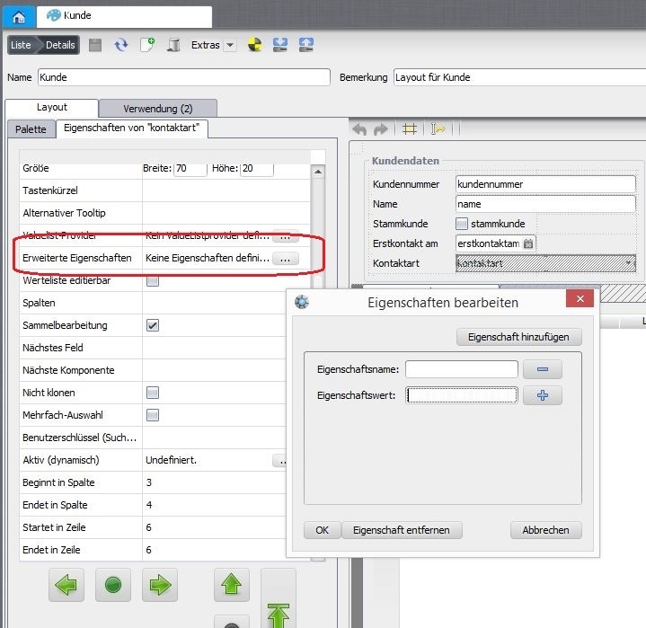
Editing extended properties.
Related pages
Überblick
Inhalte