| Auszug |
|---|
|
Nuclos layout standards checklist: form layout, layout panel, spacing, TabbedPane, subform, combo box, value list provider, work environment. |
 Language: Deutsch · English
 Layout standards checklist
Checklist for consistent form layouts – structure, spacing, tabs/subforms, components and work environment.
| Status |
|---|
| colour | Blue |
|---|
| title | Configurator |
|---|
|
| Status |
|---|
| colour | Green |
|---|
| title | Updated: Jul 2026 |
|---|
|
| Status |
|---|
| colour | Grey |
|---|
| title | applies to Nuclos 4.2026.x |
|---|
|
This checklist enables a quick review of form layouts and helps enforce consistent standards across projects.
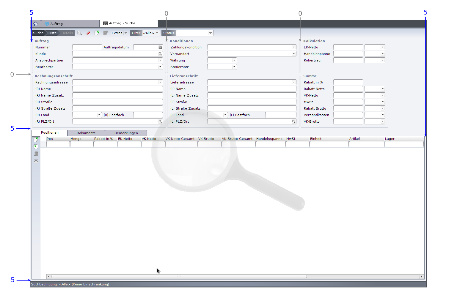
Example layout of an order form
Main layout
- Design compactly; avoid oversized fields and large label-field gaps (use field widths that fit the content).
- Avoid placing several fields side by side – except tightly related fields (zip + city, date + time, actual + target).
- A TabbedPane (if present) should use the full available height and width.
- From 3–4 fields onward, use layout panels for sensible grouping.
- Title of the first layout panel (top left) = the BO name.
- Each layout panel needs at least one column with „use remaining width“ (possibly the label column).
Spacing
- Always hide the default border.
- Instead add left/right columns and top/bottom rows of 5 pixels (default border).
- The default spacing between two objects and between two rows is 5 pixels.
- Above a TabbedPane always add a standard row of 22 pixels height.
- Spacing between adjacent subforms: 20 pixels.
- Subform components always belong in a TabbedPane (even for a single subform).
- If a tab contains only one subform or a text area, it should fill the tab without borders.
- Multiple subforms in one tab get explanatory headings.
- Fields with file attachments need a border (e.g. engraved, lowered).
- Prefer placing text areas in their own layout panel (with border) or their own tab (no border).
Components
- Choose „do not clone“ and „active“ deliberately per component.
- Set non-writable fields (calculated / rule-driven) to inactive.
- Reference fields with few entries (≤ 10, e.g. salutation, priority) as combo boxes, otherwise as selection fields.
- Constrain the selection sensibly via a value list provider (e.g. only active addresses matching the customer).
- Set the initial focus to the first active input field at the top left.
Work environment & result list
- Active: „hide name“ and „adopt last window settings“.
- Use the „screen“ icon.
- Assign the „general“ work environment to all user groups.
- Configure the result list via sort order/column settings.
- Publish these settings to the workspace so all users can use them as a template.
Related pages
